ZLG's Zelda II-themed Stream Layout
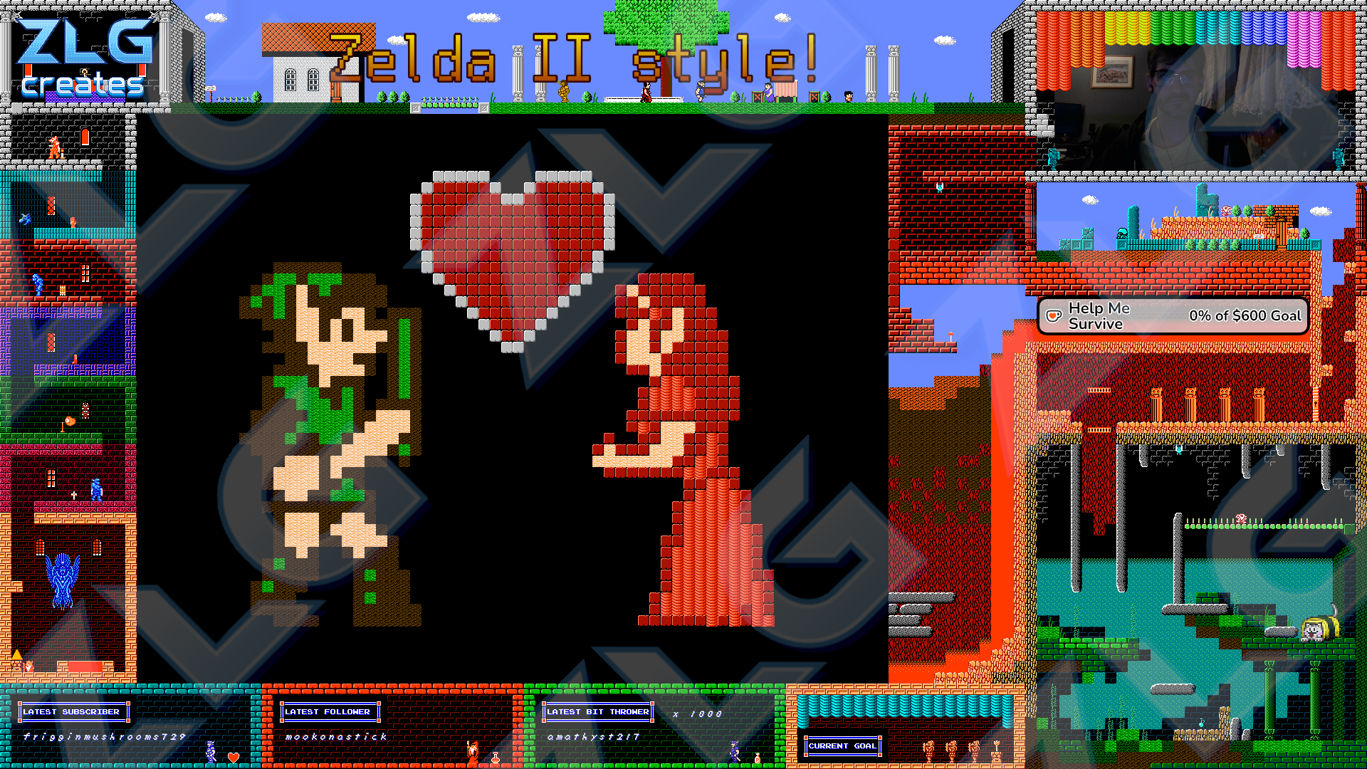
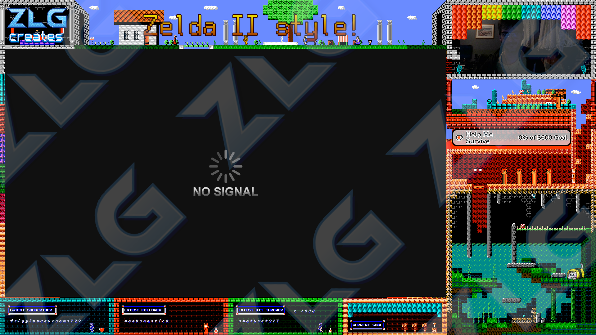
When I received ProMotionNG as a gift, the first thing I wanted to explore was its color bit-depth and tiling capabilities. I was trying to come up with something new to do for my stream, and the first thing that came to mind was a new layout. I wanted to use a game that you don't see represented often in stream layouts, but was a good showcase of the game's flavor and what I personally like about it as a game.
I settled on Zelda II: The Adventure of Link. It's a "black sheep" within its own series, but it is still a good game and concept under the layers of jank and general lack of budget put into the game. I have always wanted Nintendo to come back to this game and give it a proper re-imagining, while remaining more-or-less faithful to the original. They'd done this before with Metroid: Zero Mission and Samus Returns, oddly both from the same franchise. Why shouldn't Zelda II get a modern Metroidvania re-imagining? But I digress.
To some extent, this layout was an experiment, of sorts. I went into this project wanting the answer to a few questions:
- Is ProMotionNG something I can lean on for professional work?
- Can I leverage my prior Javascript and PICO-8 knowledge to animate in a browser source?
- Can I produce layouts that are fun and legible?
Planning
Before I began any brainstorming, I wanted to break down what a stream layout really is and what it typically consists of. This is a broad question to ask, because everyone's stream is a little different. Some people do anonymous follow acknowledgement, others want to shower the follower in attention and welcome them. Some streamers want to show chat on screen, some don't. You get the idea. But, to build a layout, you need to account for these differences in preferences, and make things in a composable or movable way.
I started with a sort of template or blueprint for myself, aligned to a 16x16 grid. The core elements my layout takes into account are:
- Logo
- Stream Title
- Video Capture (i.e. "the content")
- Webcam/VTuber
- Reactiv Fugi or other VC participant overlay
- Stream Goals
- Accolades (last subscriber, follower, bit contributor)
- Chat Box
From the beginning, I knew I wanted a sort of "town" along the top, the curtained area in the top right, and some representation of every dungeon's tileset, on the way down to Thunderbird. I also wanted contrast in the layout instead of all blue sky, red caves, or darkness.
In the bottom right is where miscellaneous widgets and other things go, so I used that area as level design experimentation, and settled on an underwater ruin -- something that wasn't actually in Zelda II.
Building
ProMotionNG has support for tilesheets, which you can use to build scenes in the editor, much like you would in an actual video game. It takes some finagling with modes, but it's doable.
It was hard for me to keep track of layers when I was building. One idea would lead me down the road to another layer, and I'd come back to another task and screw it up. I was still gaining familiarity with the tool, though, so that's to be expected.
Along the bottom, I gave myself space for the accolades; essentially just acknowledging the last people who contributed to the channel in some way. Some people really like to see their username in these fields, because it gives them a sense of contribution and belonging. I like to promote this, so I wanted each accolade to have its own theme and NPC association. I set up browser sources with both StreamElements and Firebot for the usernames, so some tweaking of fonts and coordinates was necessary.
The lavafall was sort of a cop-out, because there wasn't much room to do something impactful. It wasn't going to lead anywhere, and it's in the space that would be covered when a 16:9 source is visible. So, I made a drop-off with the tiles the game had, and set up a sort of platform that maybe people would be flung into. I mean, there's a giant hole near the King's Tomb, so it's not unlikely for there to be holes all over the place! Hah!
Along the left side, I wanted to have one floor per dungeon style, and culminate in a room containing the Thunderbird and the last piece of the Triforce. On each floor, I wanted the dungeon's primary item, and a notable enemy from that dungeon that would be easy enough to program its animation in Javascript.
Animating
Animating tiny pixel art on a giant 1080p canvas can be done with some crazy, giant GIF or other format, but realistically you should be taking the tiny graphics and doing things with them to animate. Why? It's easier to change if you mess something up, generally, and it can make parts of your workflow repeatable on other assets. Reusability is a virtue in asset production!
In an OBS environment, that means either hooking graphics up to plugins, or a browser source. I wanted something easy to use and share, for example if I made stream layouts for other people in the future. That calls for a browser source. Plugins are nice, but they can change between versions, their compatibility with OBS versions can change over time, and sometimes their developers lose interest in maintaining it or are pushed away from development because of some sort of drama. This makes a self-contained browser source a longer lasting artifact to use -- at least for animations -- and I can reasonably guide someone on extracting it somewhere and adding it to their OBS scene.
Coding
For starters, I do not like Javascript. It's the jankiest language I've
ever used, and that's saying something because I also know PHP. Dealing with
differences between Firefox and CEF was also a pain in the ass. That said,
the <canvas> API isn't the worst thing I've seen. I chose that because the
built-in animations API is for the curve-based presets that are also used by
CSS. I had odd results when I tried to "just use the Animations API" like
current advice indicates. When you're doing pixel-level manipulations or trying
to re-create movement from a video game, you need to build the animation like a
video game.
So, that's what I did. There's a function you can hook into that's tied to the
refresh rate of the canvas element. That's effectively a frame, so I used that
as my primary loop event, and built each animated entity as a simple object
containing a few fields like x, y, current_frame, and so on. This is
close to game development with PICO-8, since Javascript objects and Lua tables
are similar. From there, all animation would simply occur in each object's
update() method, and track state internally. No more image editing from here,
it was all "update this sprite at this time" or "wait this many frames, and do
this" in varying forms.
Flying or floating objects were harder to implement, partly due to unfamiliarity with sin() and cos() on an intuitive level. Some day I'll be able to abstract it in my head, but for now it was a lot of tweaking before I got something that resembled the original behavior. The Thunderbird in particular took a lot of iteration before I felt it was more than a static oval path.
Result
I'm largely happy with the result! It was a great learning experience, too. There's a lot of animation on the screen, the colors are bright, it's just solid for classic 4:3 gaming. It's not suited for every game, however, so I paired it with a transluscent Color Source so I can darken the scene for darker content. It retains the same look while giving it a "lights off" feel.
The answer to all three of my questions was "Yes," for what it's worth. :)
DISCLAIMER: The original game tiles belong to Nintendo Co., Ltd. The only ownership expressed here is over the layout design itself and the code used to animate sprites.