Handcrafting an SVG Logo
If you've spent any time viewing diagrams on Wikipedia, you'll see notices on some images that mention that the image was (re)written by hand to reduce its size. Curious, I wanted to build something in Inkscape, then rebuild it by hand to see the difference. The old logo wasn't really working out any more, so it was a great opportunity to revisit the design and learn (yet) another markup language.
Step 0: Analyze your past work
This step may not be relevant if you're building an idea from scratch. For me, the goal was to create a better logo than my previous one:

I asked, "What is this logo doing wrong?" Answering that was easy:
- It's using a serifed font, while the website uses sans-serif. This can be ignored if you're aiming for a particular style, but it clashed with the soft, friendly lettering on what I call the "rounded squares on blue" theme. The font wasn't chosen with any particular purpose, and it shows.
- Why is it underlined? To separate it from the icons? Not a very intuitive choice.
- The icons don't appear to add much to the image. They represent what I do,
not who I am. What's stopping me from adding a second row of unnecessary
icons? A logo is an icon.
- On that note, why did I write Hello World in C when nobody's going to read that text? It's showing line numbers for lines that don't have content, too.
- The spacing between the Z and L is wider than between L and G.
- The spacing between the top of the icons, the line, and the bottom of the text isn't the same.
We'll let the last two slide for now. Overall, the logo is put together well: it's evenly spaced around its edges and the three icons are equidistant to each other. However, it's just a hodge podge of activities and a pseudonym with an ill-suited font.
We can do better than that.
Step 1: Sketch it out
Some people like to skip this step, but I consider it an important part of the process. Whatever tool you use, try to use one with the least amount of "resistance" between you and the idea. For me, it was a pencil and graph paper. You could use a tablet, a Boogie Board, or your standard image editor. Whatever you use, get the idea onto something, and tack on a few alternative ideas if you have the room.
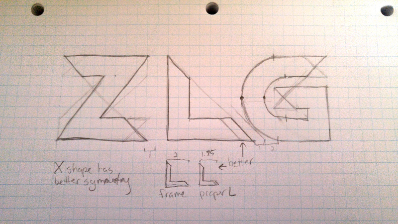
There were a lot of ways to draw my logo. I sketched them all out and brainstormed on possible alterations to improve the look.
Each glance at it got me a little psyched up about what it could be, until I gave in and started learning SVG. Before that, I needed to move onto the next step.
Step 2: Build it in a vector editor
I use Inkscape for visual editing of SVG files. Despite it pushing out larger files than what you'd normally write by hand, it's useful to transfer the sketch to the computer and, again, just get it out there. This process is iterative, so it's easier to have an image you can visually manipulate. At this stage, I tried some variations and threw on a few guide lines to see how I felt about the composition.
Each glyph is a maximum of 8 × 8 blocks. I used 8px × 8px blocks, but you can (and should) use larger ones -- a power of two, if possible -- to make your image scaling-friendly. Letters have a line width of two blocks, and there must be one block between glyphs. Seems easy enough, right? These opinions come from working on pixel art and toying around with the grid when I made the rounded-squares-on-blue site layout. Some designs work better in multiples of three. Whatever you choose, make it consistent!
Step 3: Analyze your options
If you came up with enough ideas for your logo, there were probably a few ideas that sucked. That's okay; use this step to determine which ones suck, and why. I'll go over a few of the ideas I had:
Draft 1
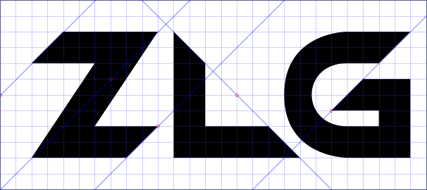
This was one of the first drafts. A neat property of the Z is it's a rotated mirror of itself along its spine (see the diagonal blue line striking through it). I like that, but the top and bottom arms look like I just sawed off the ends without caring about how it looks. It almost looks like the Z has a drop shadow, which isn't what I'm looking for.
The L looks like someone cut a box in half diagonally. The bottom leg is too long. Shortening it by one block will give it a more natural shape, since we don't normally write L's with such a long leg.
The G actually looks kinda slick since the edges line up and have the "razor cut" feel. Still, there's a little too much parallelism happening for me.
Draft 2
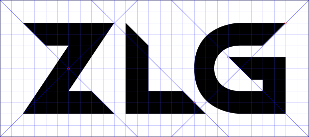
This one addresses the issues I had with each of the letters: the Z's edges create an X with the guide lines, right in the center. To me, that's a hint that you're doing things correctly. There's a symmetry to it. The L's leg was shortened, and the G's bottom line edge just flipped. So far so good... except the line width of the G's curve. See how it's just shy of two blocks wide? That's a bit of an issue.
Draft 3
It's an easy fix: just move the handles of the cubic Bezier curve out a little. Doing this breaks the grid a little bit in terms of curve handle placement, but it achieves the end goal of matching line width:
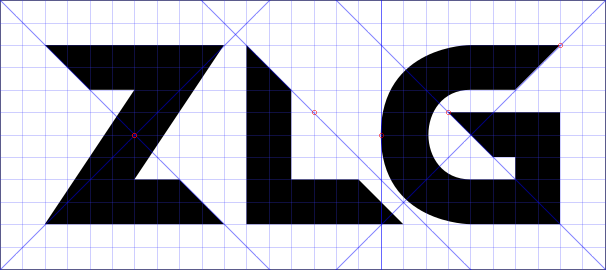
See? Now the G's curve's width is roughly 2 blocks wide. It's actually slightly wider, but tweaking this too much is a waste of time for now. We have things essentially where they need to be. There are two blocks of spacing around the logo, one block between each letter, and each letter matches the requirements for style.
Step 4: Write the SVG
If you're lazy or don't care about file sizes, you can edit the Document Properties in Inkscape, fill it in, save it, and forget about it, but I've read about ways for SVGs to be smaller and more powerful, so it was a great opportunity to learn SVG syntax. That way, all I need is a browser and a text editor to build a vector image. Before we crack open our favorite text editor, let's get a look at where our vertices will be:
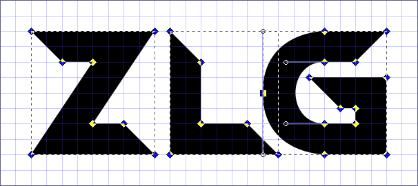
(Hint: You can do this in Inkscape by clicking on the Node tool (F2 by default) and hitting Ctrl+A to select all paths)
Great, we have our vertices, along a configured grid. This is all we need to copy it in text form!
Mozilla has good documentation on SVG structure, which was instrumental to my learning. Here's the markup and final result:
<?xml version="1.0" encoding="UTF-8" standalone="no"?>
<!-- ZLG Logo, Copyright © 2018 zlg. All rights reserved. Source provided for
educational use. -->
<svg
    xmlns="http://www.w3.org/2000/svg"
    xmlns:xlink="http://www.w3.org/1999/xlink"
    width="216" height="96"
    viewBox="0 0 216 96"
>
    <symbol id="zlg_logo">
        <path
            d="
            M  16  16
            l  64   0
            l -32  48
            l  16   0
            l  16  16
            l -64   0
            l  32 -48
            l -16   0
            Z"
        />
        <path
            d="
            M  88 16
            l  16 16
            l   0 32
            l  24  0
            l  16 16
            l -56  0
            Z"
        />
        <path
            d="
            M 200  16
            l -16  16
            l -16   0
            c -22   0, -22  32, 0 32
            l  16   0
            l   0  -8
            l  -8   0
            l -16 -16
            l  40   0
            l   0  40
            l -32   0
            c -42   0, -42 -64, 0 -64
            Z"
        />
    </symbol>
    <use xlink:href="#zlg_logo" href="#zlg_logo" fill="#000" stroke="none" stroke-width="0" x="0" y="0" />
</svg>
When you save that and open it in your browser, you should see this SVG output:
Pretty slick, huh? 1
Anatomy of an SVG file
SVG files have a root container element (<svg>) that needs to tell the XML
parser what its namespace is, its dimensions, and the viewBox. For the sake of
simplicity, we'll say it's boilerplate. Inside this element is where all the fun
happens. This is nothing new if you've written any XML-based files before.
Next, I created a <symbol> called "zlg_logo", which I'll refer to later.
Symbols are places where you can group shapes and paths, but won't draw them
to the canvas automatically. The group element (<g>) groups while drawing, and
<defs> acts similar but is less semantic.
A brief caveat: <symbol>s need to be larger than the <path>s they're
wrapping if you want to include effects like outlines or blurred shadows.
Otherwise, the bounding box of the symbol will clip the drawing effect.
Inside the symbol are three <path>s; they are the letters of the logo. I
could've added id="Z" and so on to them, but it's unnecessary since they make
up one logical structure.
At the end, I <use> the symbols and style them, much like I can in HTML. The
division between symbol and use is similar to the division between HTML and
CSS. You want the data (your paths, symbols, shapes, text) to be separate from
how you present it (CSS, inline styling, <use>).
The fun part is the <path> element. The d attribute is short for "data". I
prefer to think of it as "directions" or "definition".
Path syntax
<path> is possibly the most powerful element in SVG. The d attribute has a
sort of syntax. I separated each "command" by a new-line above to make it
clearer. SVG places little restriction on how you construct your paths. Each
"command" expects a certain number of arguments. To understand the commands, you
need to first understand the difference in case: M and m are two different
commands: uppercases work on absolute coordinates, while lowercases work on
relative coordinates. I prefer using relative coordinates inside a <symbol>
element so I can move things around, resize, or transform them without having to
translate or edit the absolute coordinates inside the path. Your needs may
differ.
So, in the first path (the "Z" glyph), the first command is to Move the
cursor to 16,16, from the top-left corner of the image. Then, draw a
line going 64 units to the right, and 0 units vertically. The "Z"
glyph is a fairly simple shape, so the l commands continue until I reach the
end, where the Z command closes the shape with a straight line, skipping me
from writing out l -16 -16. Lowercase z does the same thing.
Later in the file, I do cubic Bezier curves, which take three arguments:
the coordinates of the two curve handles, and the coordinates of the curve's end
point. If you're doing a relative c, all coordinates are in relation to the
origin point of the curve!
Conclusion
With four "path verbs" inside three paths inside a single symbol, I've built
a logo that can be transformed, (re)colored, stretched, zoomed, embossed, and
more, without ever touching the commands that built it. Here are a few versions
that I came up with using only a few <use> elements:
(Okay, I cheated and learned how gradients work for the last one.)
There's a lot more to SVG than the brief bit that I've explored in this post. Some people have made real-time clocks (shout-out to stderr@mastodon.social), Connect Four clones, and much more. I hope that what I've covered here has helped demystify SVG a little bit and encouraged you to explore what text-based vector formats can do for you.

P.S. For comparison, my hand-written SVG file is under a kibibyte, even with all the extra whitespace. The Inkscape version was almost 5 KiB.
-
2018-09-07 - In a prior draft, the
xlinknamespace wasn't included. This breaks symbol linking in SVG 1.1 and below. In SVG 2, the xlink namespace isn't needed. Both forms of linking are included for compatibility. I didn't discover this until I tried to use an SVG image as my avatar on the Fediverse. It also didn't show up correctly in file previews. Be sure to include thexlinknamespace if you plan to use the linking facilities! ↩